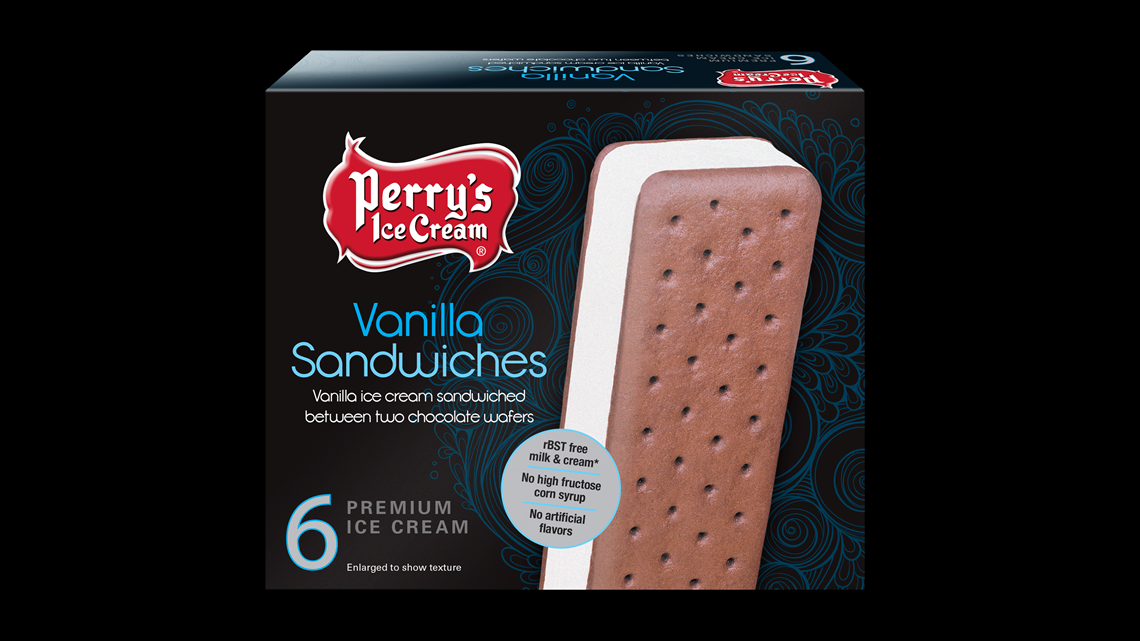
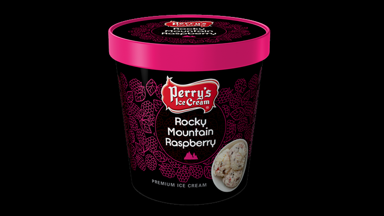
BUFFALO, N.Y. — One of Buffalo's favorite brands will be getting a new look this year when Perry's Ice Cream rolls out a new marketing campaign, packaging and signage.
You'll see some new ads for the company and the website will get a reboot, but the thing most of us will notice most of all is the new packaging.
The Perry's red crest logo that everybody knows will remain the same. But ribbons around the flavor names have been eliminated in favor of branding stamps that they say will enhance the pop of the new fonts.


"The Perry's brand embodies the happiness that naturally comes with enjoying our products along with a slightly unexpected playful side," said brand manager Nichole Buryta. " Our 100-year-old brand relays trust and provides comfort while having a sense of humor when it comes to all of life's moments. This drives a deeper sense of connection with all consumers regardless of age or status."
The company expects most of the new packaging, along with some new product launches, to hit the shelves by spring.
RELATED: Cuomo targets so-called 'Pink Tax'


